Label Design
There is a lot more to selling even a simple product than most people might think. In many cases, making the product itself is actually one of the easier steps to accomplish. While selling a product like Chadwick's Craft Spirits, there are many other elements to consider. One of the most important is the bottle's label.
We have been working with a Graphic Artist for months, considering all kinds of things that would seem a million miles away from just making and selling a simple, homemade product. But everything about the look of the label was important. It needed to have just the right feel. We wanted to be sure it expressed not only what the product is, but where it came from and represented.
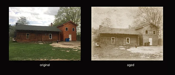
One of the things the artist did was show us an example of taking a recent photograph of the cabin, and "aging" it in the computer. And once we saw that, we knew it was the direction we wanted to go.
From there we began deciding upon things like fonts, borders, and all of the legal "disclaimers" that products like ours need to have. Surprisingly, even exactly what to call the product needed to be completely agreed upon. But at long last, here in this post, we are happy to show the actual front Label Design for the first batches of Chadwick's Maple Craft Spirits.
